
How to Turn a Simple Template into a Beautiful Card Ready for Print or Digital Share
Templates often look plain when first opened, yet a simple framework can transform into a polished card once each element receives careful attention. Many people start with a template because it removes the fear of an empty page and creates a ready-made foundation that already carries structure.
A card for print or online share benefits from clarity, solid layout choices, and thoughtful visual decisions. Every event, message, or celebration gains impact when the card feels balanced and easy to follow.
A template provides the bones, but the final result depends on practical steps that shape color, typography, spacing, and overall flow. Design becomes far more manageable when the creator takes the time to align those pieces with the message.
How To Shape A Template Into A Strong Starting Point
Early adjustments decide whether a card feels coherent or chaotic. Many tools, including a card generator, offer quick previews and sample combinations that help users understand how different choices affect the overall result. A good plan begins with intent.
A card creator needs to decide what the card must say, who will see it, and how formal or casual the tone should feel. That choice influences color range, font character, and visual rhythm. Templates include placeholders, but placeholders need replacement with real content as early as possible because real content reveals spacing issues that often hide behind dummy text.
How To Build A Base That Fits The Purpose
Templates feel far more flexible once unnecessary elements disappear. Background shapes, stray icons, and decorative pieces that do not serve the message often distract the eye. Removing clutter opens space for a cleaner layout and stronger message delivery. A solid base emerges when the creator chooses a color family, a general mood, and one main focal point.
Helpful early steps:
- Replace placeholder text with real content
- Remove shapes that serve no purpose
- Set a main color and a supporting hue
- Pick a general mood that matches the event
- Adjust margins to ensure comfortable spacing
How Color Decisions Influence Tone And Readability
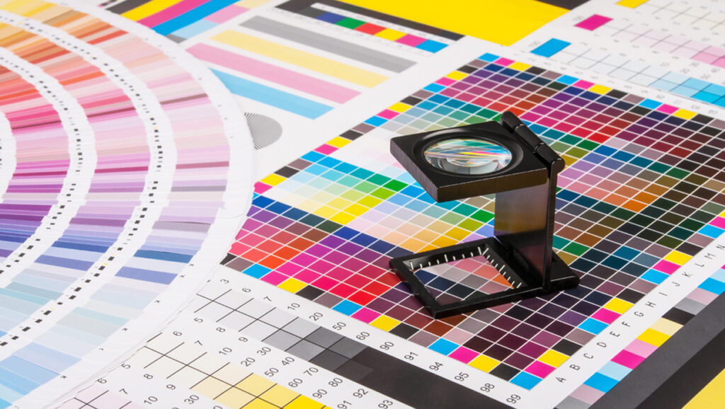
Source: riso.co.uk
Color controls first impressions. Soft hues create calm energy, while stronger tones add intensity. Many people underestimate how much emotional weight sits inside a simple color choice. When colors fight for attention, the entire layout feels noisy.
When colors support each other, the message lands without strain. Templates help because many contain predefined color blocks that simplify early combinations. A creator can adjust saturation, brightness, and contrast until the palette fits the theme.
How To Choose Colors That Work Together
A reliable palette usually consists of one dominant color, a secondary color that reinforces the theme, and a small accent color that highlights key details. Too many colors often create confusion. A card meant for print requires contrast that remains stable on paper, while a card meant for screens requires colors that remain legible under varied lighting conditions.
Guidelines for steady color work:
- Use one main color across larger zones
- Add one secondary color for headers or borders
- Use an accent tone in small amounts
- Test legibility on both paper and screens
- Keep saturation under control to avoid eye strain
How Font Selection Shapes Personality And Clarity
Typography sets the voice of the card. Serif fonts often feel formal. Softer sans-serif fonts usually feel friendly or casual. Playful typefaces create light, energetic moods. Templates often come with font suggestions, but adjustments are usually needed to match the message. A card with long text sections needs a calm, readable font. A card with short phrases can support bolder style choices. A mix of two fonts usually provides enough variety without clutter.
How To Pick Fonts That Support The Message
A clear header font gives structure to the hierarchy. A softer body font helps readers scan the content without effort. Line spacing, letter spacing and size must remain consistent from top to bottom. Poorly matched fonts distract from the message, while well-paired fonts guide the reader naturally.
Font setup tips:
- Use two fonts at most
- Choose a header font with balanced weight
- Keep the body font smooth and readable
- Test sizes for both print and digital display
- Avoid fonts that distort when scaled
How Layout Choices Control Flow And Visual Logic
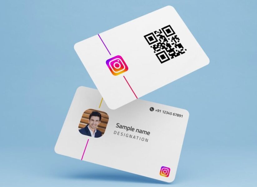
Source: instagram.com
Layout directs the eye. Cards feel comfortable when the information follows a natural route from top to bottom. Templates usually include guides that help align objects, but final placement still requires judgment. A strong layout places the most important element near the top, provides breathing room around text and keeps decorative pieces from crowding essential information.
How To Build A Layout That Guides The Viewer
A clear structure begins with a defined hierarchy. A header introduces the message. A symbol or photo reinforces the theme. A text block explains details. A footer holds practical information such as dates or locations. When each part sits where the reader expects it, the card feels organized and easy to follow.
Ideas that stabilize layout:
- Keep text aligned consistently
- Maintain equal spacing between sections
- Center the main image if it acts as the anchor
- Leave room above and below headers
- Limit footer content to essential details
How To Prepare The Final Design For Print And Digital Use
Printed cards and digital cards operate under different technical rules. Paper absorbs color in a way that screens do not. Screens change brightness and contrast based on the device and the environment. A card must hold up in both conditions if it will be shared across formats. Templates often include safe zones for print bleed and digital cropping, yet final checks remain essential.
How To Finalize A Card For Different Formats
Creators benefit from reviewing the entire design once content, color, and layout reach their final shape. Print shops require high-resolution files, while digital platforms function better with compressed formats that load quickly. A full check prevents misalignment, blurry images, or clipped edges.
Final prep tasks:
- Look for uneven spacing or stray elements
- Fix any spelling or punctuation faults
- Test a sample print at home before professional output
- Preview the digital version on both phone and desktop
- Export separate files for print and digital share
Source: printplace.com
Closing Thoughts
Card design improves once a template receives careful attention, purposeful choices, and consistent structure. Color, spacing, typography, and layout all contribute to a result that feels composed and practical.
A template offers a reliable foundation, but the final appearance depends on decisions that fit the message and the medium. A well-prepared card stands strong on paper and across digital platforms without effort from the viewer, and that dependability marks a successful design.