The Invisible Design Tricks Users Actually Notice
Great design vanishes while it works. You sense it but can’t quite say why some apps work well. Your brain notices many small choices that affect your experience, even if you wouldn’t notice them directly.
Remember deleting a photo from your phone? It probably shrank down and flew toward the trash icon.
Or maybe it dissolved into pixels. That brief moment did more than look cool; it told you, “Yes, that worked” with no words.
Without the animation, you might tap delete multiple times.
Micro-Animations That Speak Louder Than Words
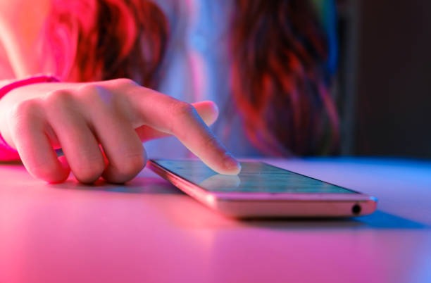
Source: istockphoto.com
Movement carries meaning. Press a button and watch it dip slightly inward. Your finger expects resistance and feedback, just like pushing a real button.
Digital things that behave like physical things make more sense to our ancient brains. Loading screens reveal designer psychology.
Some apps show spinning wheels. Others use progress bars. The trendy ones display gray boxes where content will appear.
Pick wrong and people bail. Pick right and they’ll wait patiently for surprisingly long stretches.
Here’s a neat trick: sliding between screens fools your brain. Apps don’t actually run faster with smooth transitions.
But that gentle glide from your inbox to an email? It feels quicker than an instant jump cut would.
Our brains interpret smoothness as speed, even when the actual load time stays identical.
Colors and Contrast Playing Mind Games
Red stops you cold. Always has, always will. Green says go ahead. These aren’t accidents; they’re biological responses designers exploit constantly.
Watch what happens with brightness levels. Important stuff glows while background elements fade to gray.
Your eyes can’t help but look at that vivid blue button sitting on a washed-out background. You think you decided to click it. Reality?
The designer made that choice inevitable through contrast alone.
Desktop websites pull another sneaky move with hover effects. Slide your mouse toward a link, and it lights up before you click.
Maybe the button rises slightly, casting a tiny shadow. These previews calm nervous users who wonder what happens if they click. Less anxiety equals more clicks.
UX/UI designers, like those at Goji Labs, know this and use it effectively.
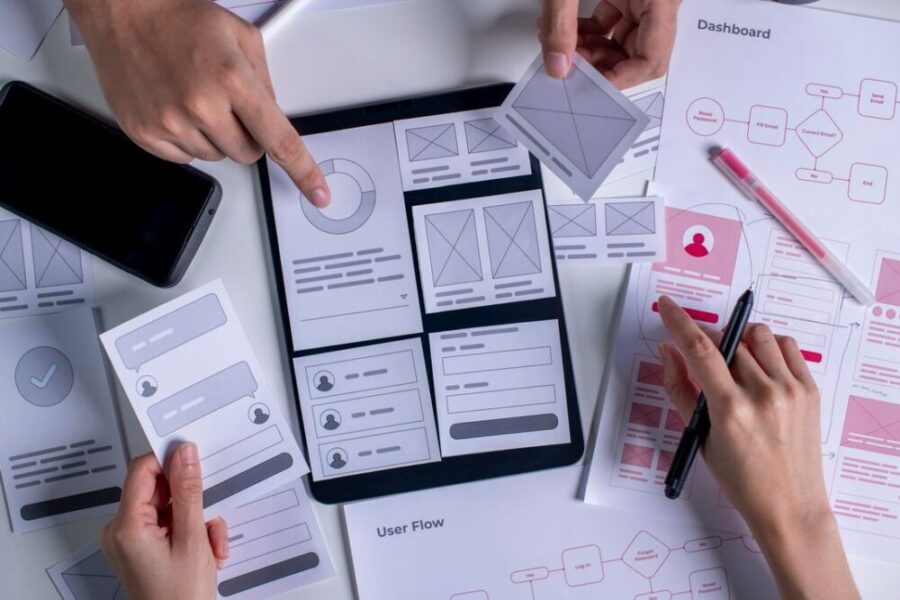
The Power of Predictable Patterns

Source: digiwijzer.nl
Your thumb knows where things live. Mess with these positions and watch people fumble like they’re wearing mittens.
Those three horizontal lines mean menu. Everyone knows this now. The heart means favorite.
The bell signifies notifications. But predictable doesn’t equal dull.
Clever teams sneak in personality without breaking the rules.
Maybe pulling down to refresh triggers a funny animation. Perhaps error messages crack jokes instead of scolding.
Small surprises inside familiar structures keep experiences fresh without frustrating anyone.
White Space: The Invisible Hero
Blank areas do serious work. Pack too much together and eyes give up.
Spread things out and suddenly everything becomes digestible.
Fat fingers appreciate roomy tap targets. Reading gets easier with generous line spacing.
Accidental clicks drop dramatically when buttons don’t crowd each other.
Yet users never thank designers for what isn’t there. They just enjoy apps that “feel clean” without knowing why.
Emptiness creates importance too. One bold headline surrounded by nothing commands attention.
Twenty headlines crammed together? They all become noise.
Conclusion
Source: usabilitygeek.com
Nobody posts reviews praising transition animations or noting perfect button spacing.
People just know when something feels right. Tasks flow. Nothing irritates.
The technology fades away. Behind this effortlessness lie hundreds of experiments.
Teams tested forty shades of blue. They argued about animation timing down to the millisecond.
Someone lost a weekend adjusting the curve of a swipe gesture. All that so users never have to think about any of it.
The ultimate invisible trick? Making complexity feel simple. When that happens, design truly disappears.